Google Docs, Sheets, and Slides will get a material you upgrade
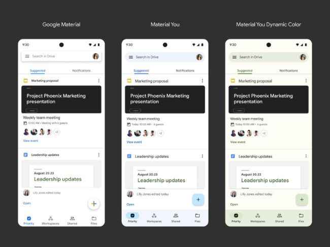
It’s been a little over a year since Google launched its Material You update, and now, the tech giant has announced that the new Material You M3 design will soon be incorporated into Google Docs, Sheets, and Slides for a more uniform experience.
The roll-out has already begun, and according to a report by 9to5Google, the pill-shaped toggle is larger than the original one, making the design more prominent. Users can also expect to see new colour trappings, the capacity to hold an icon in the switch thumb, and a taller and broader track.
 How to use the Material You toggle design?
The new toggle is available in the Editor’s Overflow Menu in the Star, Suggested Changes, Print Layout, and Available Offline sections. You can access the new toggle by navigating to these sections once the roll-out is complete.
Other Material You changesThe new toggle isn’t the only Material You change that Google has recently announced. The new Chrome Canary has also been equipped with the Material You colour changes. Chrome Canary is a new, experimental version of the browser that will offer enhanced features.
For instance, the Customise Chrome Colour Extraction feature lets users select specific shades on the wallpaper that is displayed when they open Chrome. The shade is then applied to the browser, thereby creating a custom colour scheme.
Google has stated that this new feature "enables setting theme colour based on background image colour when the background image is changed in New Tab Page".
Post a Comment